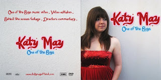
My music video and ancillary texts generally develop the forms and conventions of existing music videos, digipaks and other media products produced in the music industry. When beginning my research I analysed various existing music videos to gain better knowledge of the conventions and ideas used in them, especially videos related to the artist whose song I was using for my own video. I maintained the image of the artist, particularly in my digipak, and advertisements to make it more realistic and relatable to Katy Perry’s fan base. Although Katy Perry’s style is usually quite unconventional, I chose to dress my artist slightly more ‘ordinary’ as I felt that this would help to amplify the lyrics of the song further, portraying her as a tomboy who is easy for the audience to relate to as she tries to change her image. This develops the conventions of the existing media products that I analysed.
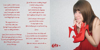
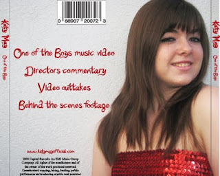
My main product and additional texts combine effectively as I incorporated similar designs and colour schemes across each product to emphasize and help promote the image of the artist ‘Katy May’. In addition to the music video, I also produced dvd extras such as outtakes, a digipak front and back cover and insert, magazine advert and webpage design. In each of the additional products, I incorporated the same red colour scheme which reflected the colour of the red dress that the artist wore at the end of the video. I felt that this created an associated image with the artist that would be easily recognizable across the advertising products. I also used a similar distinguishable font on all of the products which was similar to the font used by Katy Perry. This created a connection between all of the products and is a unique font that could be associated with the artist ‘Katy May’. I used similar photographs of the artist in each text, however if I had more time I would have taken more photographs to use a variety of settings and outfits in the webpage or magazine advert for example.
I interviewed some teenagers from my target audience to find out what their opinion of my video and other products were and I got some useful feedback and suggestions on how to improve them. After showing a group the first cut of my video, they suggested that I should include a boy character in the video as the song refers to a boy who the artist is trying to impress by becoming more girly. They suggested that I should include some footage of this at the beginning of the video where there were less shots of the narrative than at the end of the video. I took this advice and filmed some shots of the artist talking to the boy at the beginning of the song to set the narrative and show her reason for trying to change her behaviour and image. I also filmed some more footage for the end of the video, showing her going to meet the boy after she has changed her image to become more girly but seeing him with another ‘tomboy’ girl to end the narrative.
Another comment that I received from audience feedback was that there could be more settings used in the video as it was mostly filmed in my house and garden. However, due to lack of time I did not manage to film in other settings and I felt that the home setting helped to amplify the idea of the girl changing over a summer, mostly in the confines of her bedroom. If I could film the video again I would probably use myself as the artist in the video as I found it difficult to organize the other people to feature in it and I would also make use of a wider variety of settings.
I used various media technologies in the planning, research and construction stages of the portfolio. I worked on a blog to collect all of my research and display final products as this was easy to update and collect all of my work onto. It was also useful to connect with different platforms online and display my work in different ways on the blog. When planning my music video I produced various PowerPoint presentations to analyse existing music videos and present the ideas for my own which I then embedded onto the blog through a presentation supporting website. I could also upload video stills and photographs straight onto the blog as well as embed and upload videos onto it. I also created an interactive moodboard online using the website glogster.com where I could include and display photos and videos relating to my ideas for my music video. A part of my research, I made use of online media technologies such as Youtube and social networking sites such as Facebook where a majority of my target audience were available. On Facebook I found I could contact and gather people from my target audience to give me feedback on my work and to organize featuring people in my video. Youtube was useful when studying and researching existing music videos and I could upload each cut of my video to show the work in progress. I also made use of audio recordings for my work, creating a podcast for my analysis of the song lyrics and some audience feedback through a voice recording in the programme Garage Band and I used the audio settings in imovie to record my director’s commentary over my finished music video. As well as this, I used Photoshop mainly to create and edit the designs for the digipak, wepage and magazine advertisement which I could then upload straight onto the blog. I feel that I successfully used various media technologies to plan, research and design my music video and additional texts.
Monday, 28 December 2009
Thursday, 17 December 2009
Wednesday, 16 December 2009
14/12/09
Last week I finished designing my digipak cover and insert, webpage and magazine advert. I also finished editing my music video for the first cut. After getting some audience feedback, I decided that I needed to film some more footage for the beginning of the song as the shots did not vary much until the narrative started about half way through the song. I decided that I needed to get some footage of the talent talking to a boy at the beginning, showing how she wants to change to get him to like her. This was difficult to organise in a short amount of time this week however, I organised for my friend to come to be filmed after school one day. I filmed some extra footage which I will edit into my video at the end of this week.
Tuesday, 15 December 2009
Monday, 14 December 2009
Thursday, 10 December 2009
Monday, 7 December 2009
Video Outtakes
These are the outtakes to my music video which I am using as extras on the dvd package.
Digipak
 I used a medium close up shot of my artist using the rule of thirds to take my photograph, positioning the text beside her as one of Katy Perry's album covers was in a similar layout. I took the photograph of her against the plain wall used as a location in my video wearing the red dress also worn in the video as her feminine dress is in contrast to the title One of the Boys. I downloaded a font Katy Berry from Dafont.com which resembled that of the officia
 l Katy Perry font used on her album and single covers. I also encorporated the idea of using contrasting colours for her name, using a pink text for her name 'Katy May' and blue font to highlight the title 'One of the Boys'.
 For the back cover, I used a close up photo of her in the same setting with the same dress and continued with the style of writing on the back cover and on the insert inside the CD case. I printed an insert into the CD cover including lyrics to th e song and another photo of her, which will appeal to her fans.
 e song and another photo of her, which will appeal to her fans.
 Monday, 30 November 2009
Digipak research

I researched some existing digipaks and CD covers of various artists before designing my own. I looked at Katy Perry's album and single covers as I am using her song for my music video and I would like to encorporate the design into my own digipak. This is Katy Perry's One of the Boys album cover. Katy Perry is known for being promiscuous and the photo of her enhances this image as it her shows her lying on a sun longer biting a pair of glasses in a suggestive manner. She is also wearing little clothing, suggesting that she is appealing to a male audience. Katy Perry's outfit is reminiscent of the fifties era and the bright and contrasting colours of the cover reflect her unconventional style of dress. Katy Perry's name is in pink bubble writing reflecting her youth and is in contrast to 'One of the Boys' which is written in blue font. For my cover I downloaded a similar font to the one used on this cover so it reflected Katy Perry's fun and unconventional image.
 This is an alternate cover for Katy Perry's album. The same font is used for the text but in different contrasting colours. I like the layout of this cover and will use this style for my cover, with a medium close up of the artist on one side and the text placed next to her. In both covers, Katy Perry is dressed in contrast to the title of the album One of the Boys - in her official album cover, the colour pink seems to be the main colour scheme and she is dressed quite feminine in both covers, in contrast to the lyrics of the song which portray her as a tomboy. I am going to use this idea in the cover of my album.
Tuesday, 24 November 2009
Location and talent shots

I am featuring my friend Cassie as the main artist in my music video as she will be able to highlight the change in style and character of the artist throughout the song. I also used two other girl friends in the video to act as themselves,showing the contrast between the tomboy main artist 'Katy May' and the girls who she wants to be like. Their style is already quite 'girly' and so they csn use their own clothes when featuring in my video. I am filming the video mostly at my house and garden as I believe it will emphasize the lyrics of the song about changing over summer. I am filming the beginning of the song sitting on the stairs, as I felt I could use full length shots to show her boy-ish dress and posture. I am also filming outside against a plain white wall where her dress changes throughout the video - highlighting her change of attitude and style. For the main part of the narrative to the video I am filming in a bedroom - showing how she begins to change by trying to behave more girly, emphasizing the lyrics 'I started reading seventeen'. This is also where the other two girls enter the video, attempting to give 'Katy May' a makeover as her bedroom would be a typical setting for this. For the bridge I am filming outside, with the artist sitting on a swinging chair. The bridge makes references to flowers and roses and so the artist will be holding flowers and with flowers in the background of the shot to show the contrast in her style.

Wednesday, 4 November 2009
Monday, 12 October 2009
Video ideas podcast
Do Do Do Do Do Do Do Do Do Do
Do Do Do Do Do Do Do Do Do Do
I saw a spider, I didn't scream, 'cause I can belch the alphabet
Just double dog dare me 'cause I chose guitar over ballet
And I'd take these suckers down 'cause they just get in my way.
The way you look at me is kind of like a little sister
You high five your goodbyes and it leaves me nothing but blisters.
'Cause I don't wanna be one of the boys
One of your guys, just give me a chance
To prove to you tonight that I just wanna be
One of the girls pretty in pearls
Not one of the boys.
So over the summer something changed
I started reading seventeen and shaving my legs,
And I studied Aveda religiously and I walked right into school
And caught you staring at me, 'cause
I don't want you no but now you're gonna have
To take a number it's okay maybe one day
But not until you give me my diamond ring, 'cause
I don't wanna be one of the boys
One of your guys just give me a chance
To prove to you tonight that I just wanna be
A home coming queen, pin-up poster dream
Not one of the boys.
I wanna be a flower not a dirty weed
I wanna smell like roses not a baseball team
And I swear maybe one day you're gonna wanna
Make out, make out, make out with me.
Don't wanna be, don't wanna be,
Don't wanna be, don't wanna, Don't wanna
'Cause I don't wanna be one of the boys
One of your guys just give me a chance
To prove to you tonight that I just wanna be
One of the girls pretty in pearls
Not one of the boys.
Do Do Do Do Do Do Do Do Do
Do Do Do Do Do Do Do Do Do
Do Do Do.
Saturday, 10 October 2009
Thursday, 8 October 2009
Focus Group
I asked a group of people who were interested in the pop/rock genre of music to answer some questions on their music tastes and expectations of music videos. Using their answers I can ensure that my video appeals to the target audience and met their expectations of what a pop music video should be like.
Laura Roddam, 18
Laura listens to pop and R'n'B music and often watches music channels such as 4music and TMF which play chart music videos. She often downloads Hit40uk to get the latest chart music and listens to Heart Essex radio station which plays recent music. One of Laura's favourite music videos is Hot n Cold by Katy Perry as it has a good story line to it, is fast paced and fun and also features some performance shots of the artist. Laura also likes Taylor Swifts music video for Our Song and I will take this into account and use some of these concepts in my music video. Laura said she probably wouldn't buy a song just because of the music video.
Sam Stanbury, 17
Sam mostly listens to rock music but also listens to pop music and sometimes listens to Capital Radio which plays these genres of music. He also watches 4music and Viva which play recent chart music. One of his favourite music videos is Use Somebody by Kings of Leon as it shows performance shots of one of his favourite bands and he said that he would buy a song if he liked the music video and would also be encouraged to see them live. This shows that the music video is important in promoting the image of the artist and I will include many performance shots of the artist in my video.
Imogen Overy, 17
Imogen listens to chart music and also listens to Capital Radio and watches similar music channels as Laura and Sam. One of her favourite music videos is Just Can't Get Enough by The Saturdays as it is fun and lively. She said that she would be encouraged to buy a song if she particularly liked the music video and would also be encouraged to see them live if it consisted mainly of performance scenes. I shall use mostly performance shots in my music video to promote the image of my artist as well as a narrative to make it interesting.
Talking to my focus group, I found that most of them were more likely to buy a song if they liked the music video suggesting that music videos are important in promoting the image of the artist and determining their fan base. The people in my focus group mainly liked music videos that were fast paced, with a mix of performance and narrative shots. I will use these ideas in my own music video and ensure that it appeals to pop music fans.
Monday, 5 October 2009
Sunday, 27 September 2009
Saturday, 19 September 2009
Andrew Goodwin's theory
Andrew Goodwin identified the key features of music videos:
- There is a relationship between lyrics and visuals where the visuals either illustrate, amplify or contradict the lyrics
- There is a relationship between the music and visuals where the visuals either illustrate, amplify or contradict the lyrics
- Music videos use lots of close ups of the artist
- Voyeurism is frequently referred to in music videos, encouraging the notion of looking, particularly at the female body
- There is often intertextual references in music videos to films, other music videos etc.
- Music videos display the genre characteristics of the music, for example a performance in a rock video, dance routine in a pop video.
Subscribe to:
Comments (Atom)


