My music video and ancillary texts generally develop the forms and conventions of existing music videos, digipaks and other media products produced in the music industry. When beginning my research I analysed various existing music videos to gain better knowledge of the conventions and ideas used in them, especially videos related to the artist whose song I was using for my own video. I maintained the image of the artist, particularly in my digipak, and advertisements to make it more realistic and relatable to Katy Perry’s fan base. Although Katy Perry’s style is usually quite unconventional, I chose to dress my artist slightly more ‘ordinary’ as I felt that this would help to amplify the lyrics of the song further, portraying her as a tomboy who is easy for the audience to relate to as she tries to change her image. This develops the conventions of the existing media products that I analysed.
My main product and additional texts combine effectively as I incorporated similar designs and colour schemes across each product to emphasize and help promote the image of the artist ‘Katy May’. In addition to the music video, I also produced dvd extras such as outtakes, a digipak front and back cover and insert, magazine advert and webpage design. In each of the additional products, I incorporated the same red colour scheme which reflected the colour of the red dress that the artist wore at the end of the video. I felt that this created an associated image with the artist that would be easily recognizable across the advertising products. I also used a similar distinguishable font on all of the products which was similar to the font used by Katy Perry. This created a connection between all of the products and is a unique font that could be associated with the artist ‘Katy May’. I used similar photographs of the artist in each text, however if I had more time I would have taken more photographs to use a variety of settings and outfits in the webpage or magazine advert for example.
I interviewed some teenagers from my target audience to find out what their opinion of my video and other products were and I got some useful feedback and suggestions on how to improve them. After showing a group the first cut of my video, they suggested that I should include a boy character in the video as the song refers to a boy who the artist is trying to impress by becoming more girly. They suggested that I should include some footage of this at the beginning of the video where there were less shots of the narrative than at the end of the video. I took this advice and filmed some shots of the artist talking to the boy at the beginning of the song to set the narrative and show her reason for trying to change her behaviour and image. I also filmed some more footage for the end of the video, showing her going to meet the boy after she has changed her image to become more girly but seeing him with another ‘tomboy’ girl to end the narrative.
Another comment that I received from audience feedback was that there could be more settings used in the video as it was mostly filmed in my house and garden. However, due to lack of time I did not manage to film in other settings and I felt that the home setting helped to amplify the idea of the girl changing over a summer, mostly in the confines of her bedroom. If I could film the video again I would probably use myself as the artist in the video as I found it difficult to organize the other people to feature in it and I would also make use of a wider variety of settings.
I used various media technologies in the planning, research and construction stages of the portfolio. I worked on a blog to collect all of my research and display final products as this was easy to update and collect all of my work onto. It was also useful to connect with different platforms online and display my work in different ways on the blog. When planning my music video I produced various PowerPoint presentations to analyse existing music videos and present the ideas for my own which I then embedded onto the blog through a presentation supporting website. I could also upload video stills and photographs straight onto the blog as well as embed and upload videos onto it. I also created an interactive moodboard online using the website glogster.com where I could include and display photos and videos relating to my ideas for my music video. A part of my research, I made use of online media technologies such as Youtube and social networking sites such as Facebook where a majority of my target audience were available. On Facebook I found I could contact and gather people from my target audience to give me feedback on my work and to organize featuring people in my video. Youtube was useful when studying and researching existing music videos and I could upload each cut of my video to show the work in progress. I also made use of audio recordings for my work, creating a podcast for my analysis of the song lyrics and some audience feedback through a voice recording in the programme Garage Band and I used the audio settings in imovie to record my director’s commentary over my finished music video. As well as this, I used Photoshop mainly to create and edit the designs for the digipak, wepage and magazine advertisement which I could then upload straight onto the blog. I feel that I successfully used various media technologies to plan, research and design my music video and additional texts.
Monday, 28 December 2009
Thursday, 17 December 2009
Wednesday, 16 December 2009
14/12/09
Last week I finished designing my digipak cover and insert, webpage and magazine advert. I also finished editing my music video for the first cut. After getting some audience feedback, I decided that I needed to film some more footage for the beginning of the song as the shots did not vary much until the narrative started about half way through the song. I decided that I needed to get some footage of the talent talking to a boy at the beginning, showing how she wants to change to get him to like her. This was difficult to organise in a short amount of time this week however, I organised for my friend to come to be filmed after school one day. I filmed some extra footage which I will edit into my video at the end of this week.
Tuesday, 15 December 2009
Monday, 14 December 2009
Thursday, 10 December 2009
Monday, 7 December 2009
Video Outtakes
These are the outtakes to my music video which I am using as extras on the dvd package.
Digipak
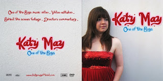
 I used a medium close up shot of my artist using the rule of thirds to take my photograph, positioning the text beside her as one of Katy Perry's album covers was in a similar layout. I took the photograph of her against the plain wall used as a location in my video wearing the red dress also worn in the video as her feminine dress is in contrast to the title One of the Boys. I downloaded a font Katy Berry from Dafont.com which resembled that of the officia
 l Katy Perry font used on her album and single covers. I also encorporated the idea of using contrasting colours for her name, using a pink text for her name 'Katy May' and blue font to highlight the title 'One of the Boys'.
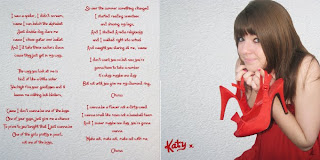
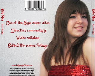
 For the back cover, I used a close up photo of her in the same setting with the same dress and continued with the style of writing on the back cover and on the insert inside the CD case. I printed an insert into the CD cover including lyrics to th e song and another photo of her, which will appeal to her fans.
 e song and another photo of her, which will appeal to her fans.
Subscribe to:
Comments (Atom)

